Dry Eye Problems
A vibrant campaign turning irritation into education.
Client
Bausch + Lomb
Role
Creative Director / Brand Concept / Visual Identity / Content Oversight
The Brief
Bausch + Lomb needed to shift public understanding of evaporative dry eye an under recognized but incredibly common subtype of dry eye disease. Awareness was low. Language was vague. People weren’t connecting their scratchy, stinging, blurry symptoms to a specific cause, let alone seeking treatment for it. Worse, many had tried other remedies and walked away disillusioned. Our challenge: educate a weary, unengaged audience without sounding clinical or condescending. We had to design a campaign that felt like it belonged in culture—not in a waiting room.
The Goal
Recast evaporative dry eye as something unmistakable, memorable, and solvable. Create an identity that could spark recognition in seconds, then linger. Turn passive sufferers into active seekers. Lay the foundation for branded treatments by elevating awareness of the core cause: tear evaporation. And above all, make Bausch + Lomb feel like a brand that sees you and helps you see better.
The Idea
*
The Idea *
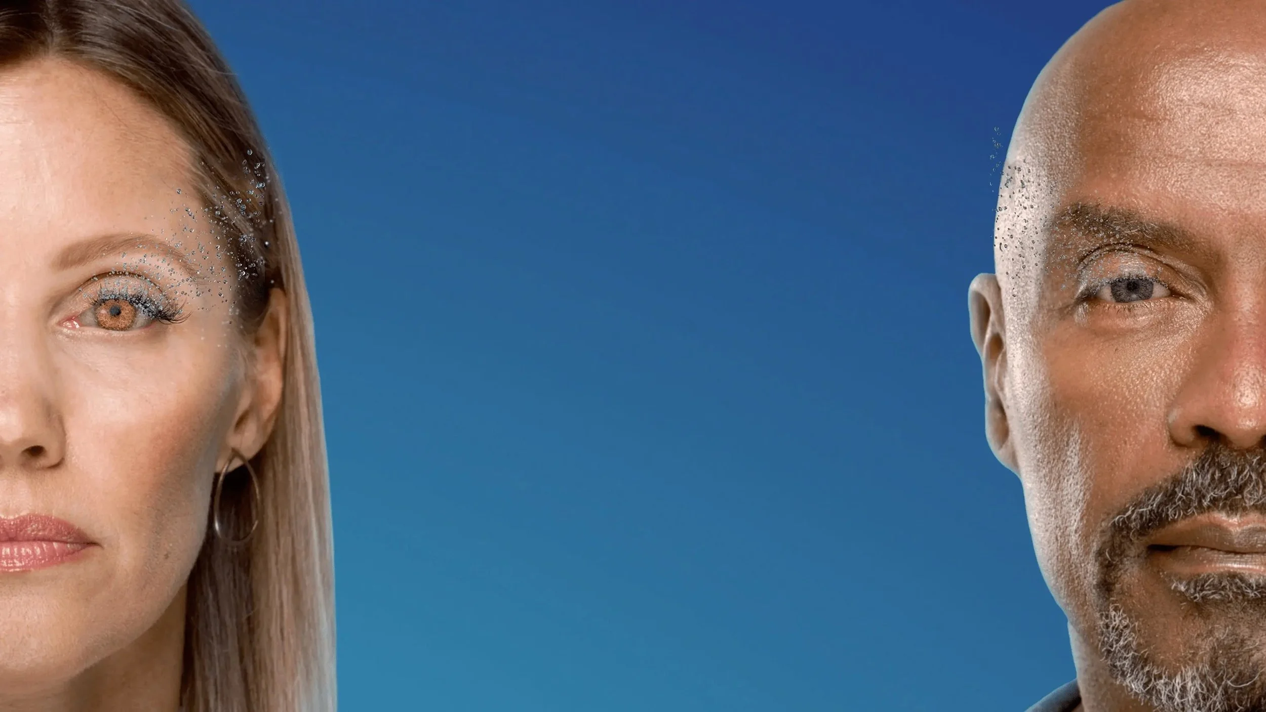
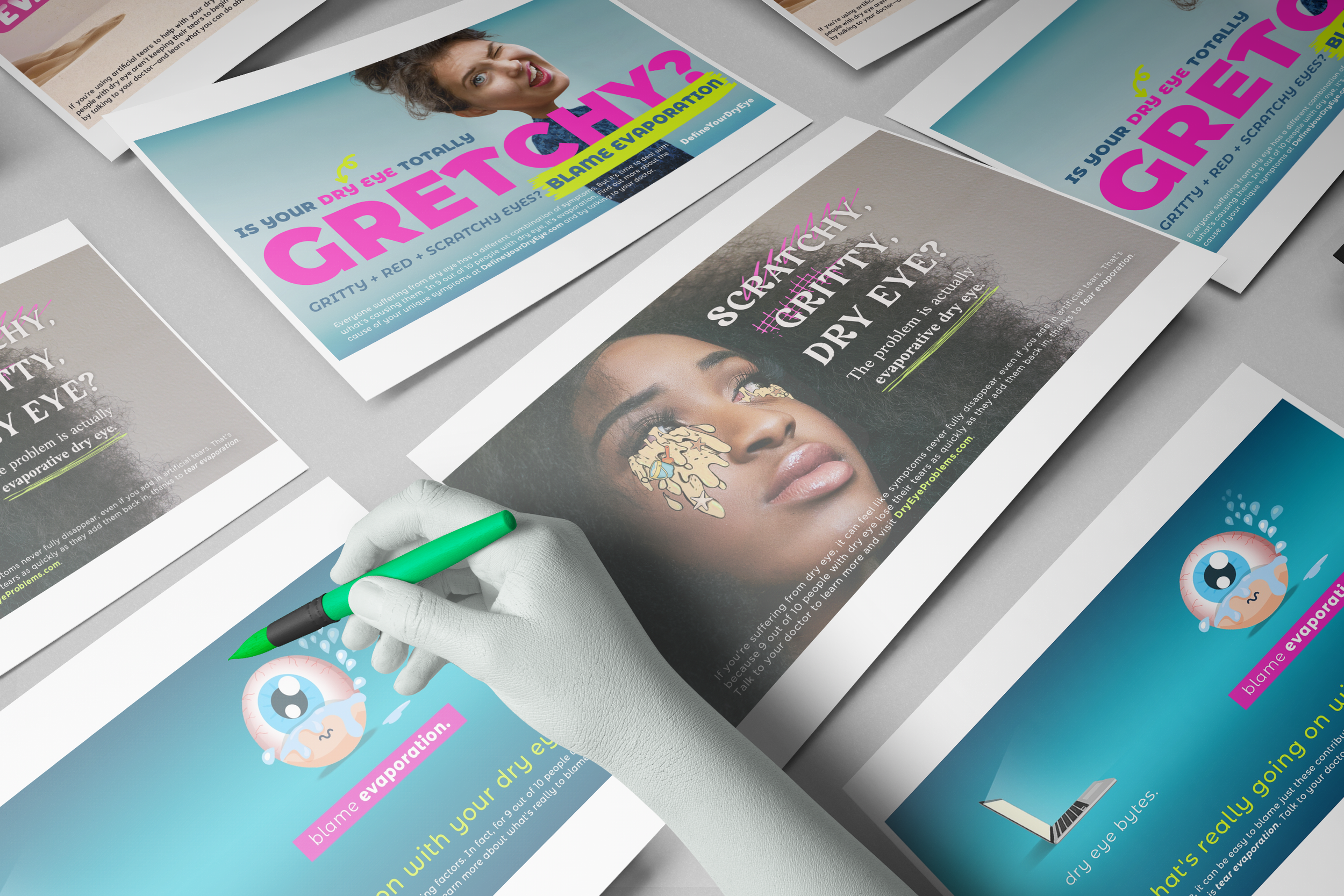
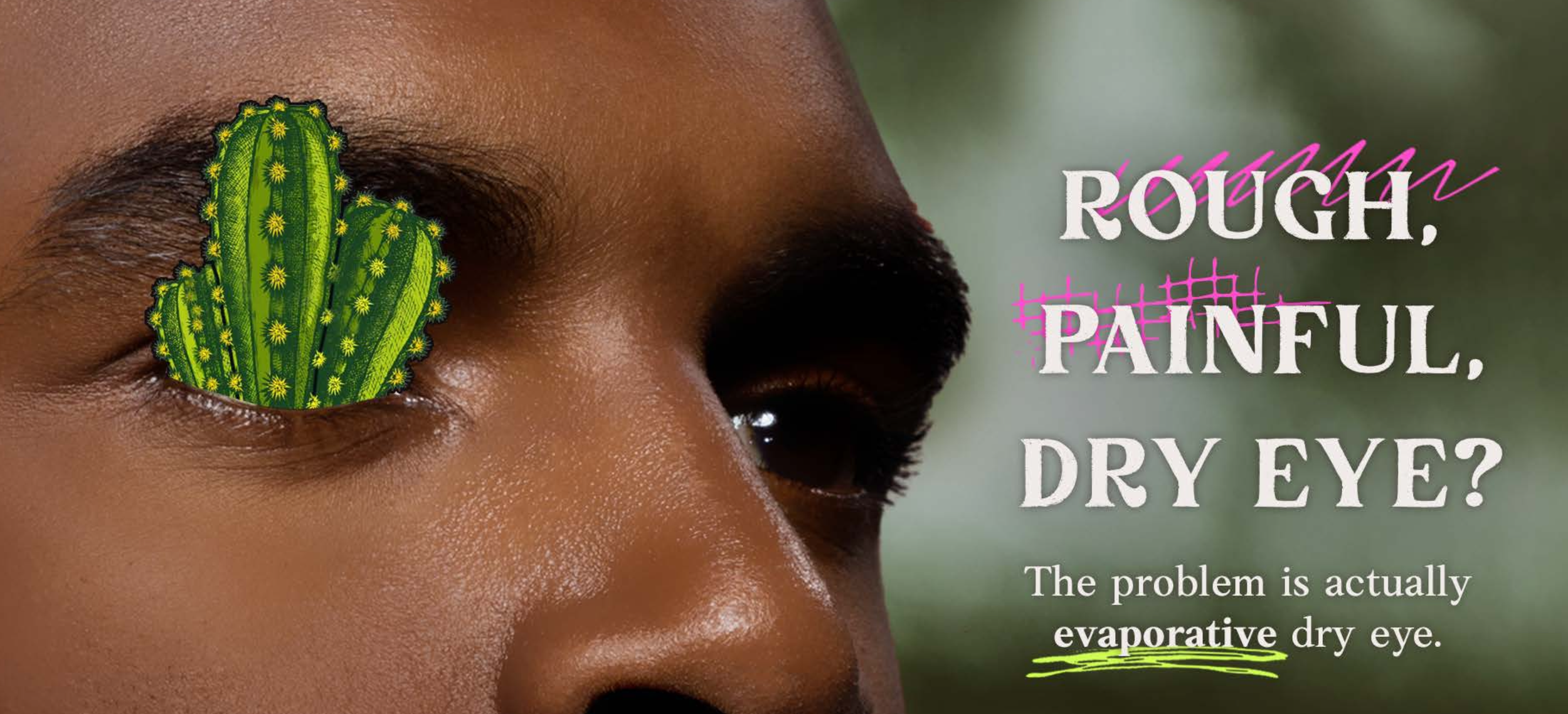
Tear Evaporation is the Enemy.
We built a fully integrated campaign around a disruptive truth: tear evaporation, not tear production is the root cause of many people’s gritty, burning symptoms.
Instead of whispering about discomfort, we shouted it. On screens, in Times Square, and on eyelids. The concept was simple: make the invisible visible.
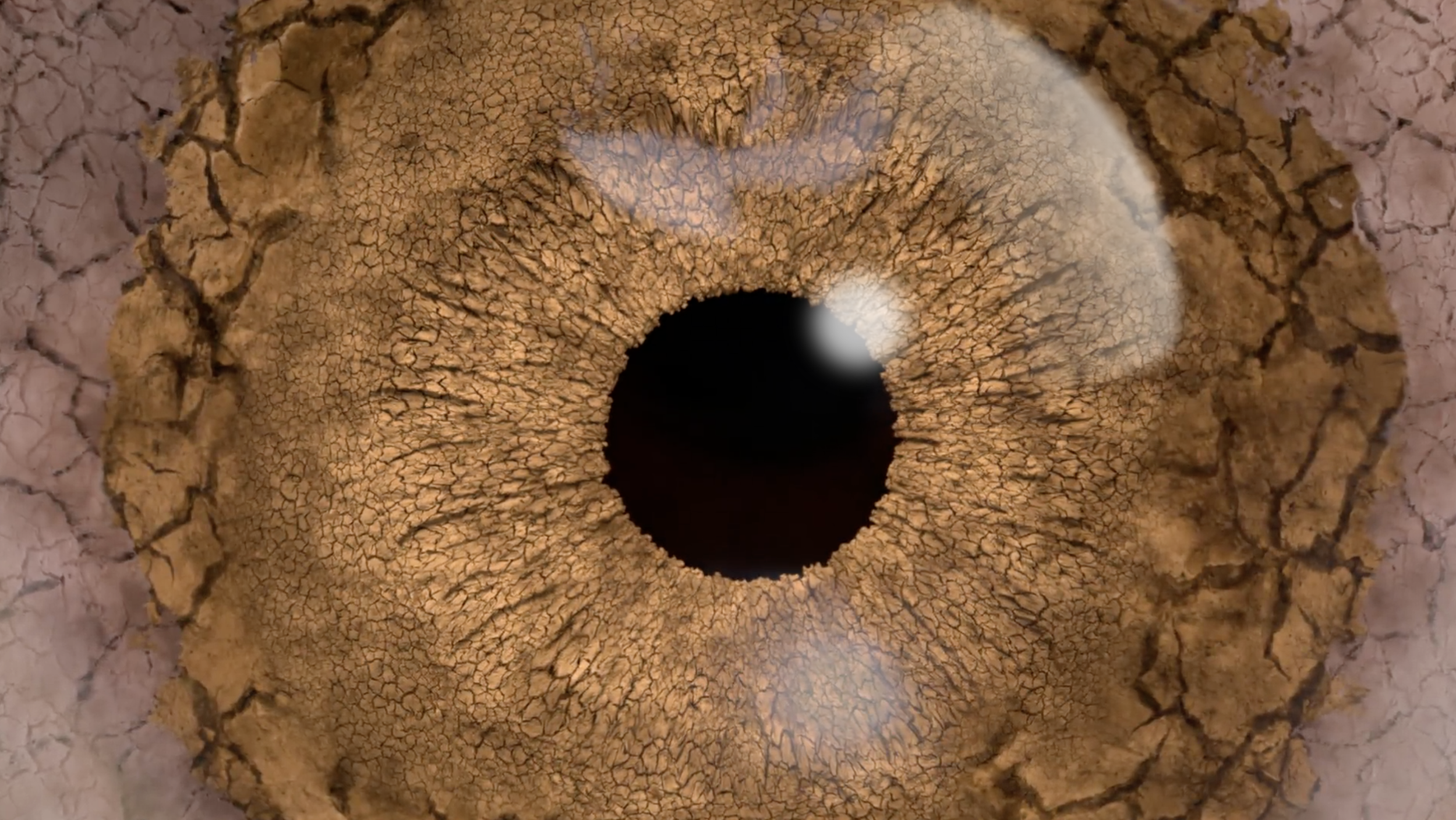
“This campaign wasn’t afraid to be strange. I led the team to push past the pharmaceutical playbook. To tap into empathy, frustration, and irreverence. Our visuals treated the eye like a design surface: raw, expressive, and human.”
-Nora Rose Travis, Creative Director

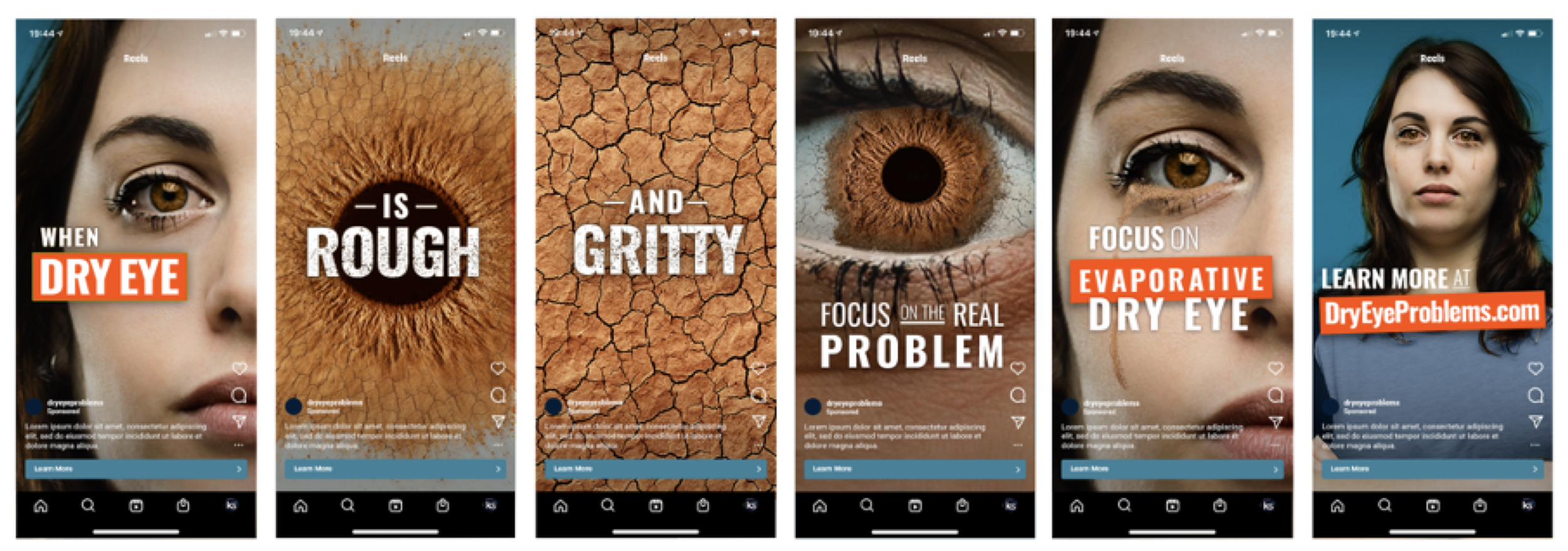
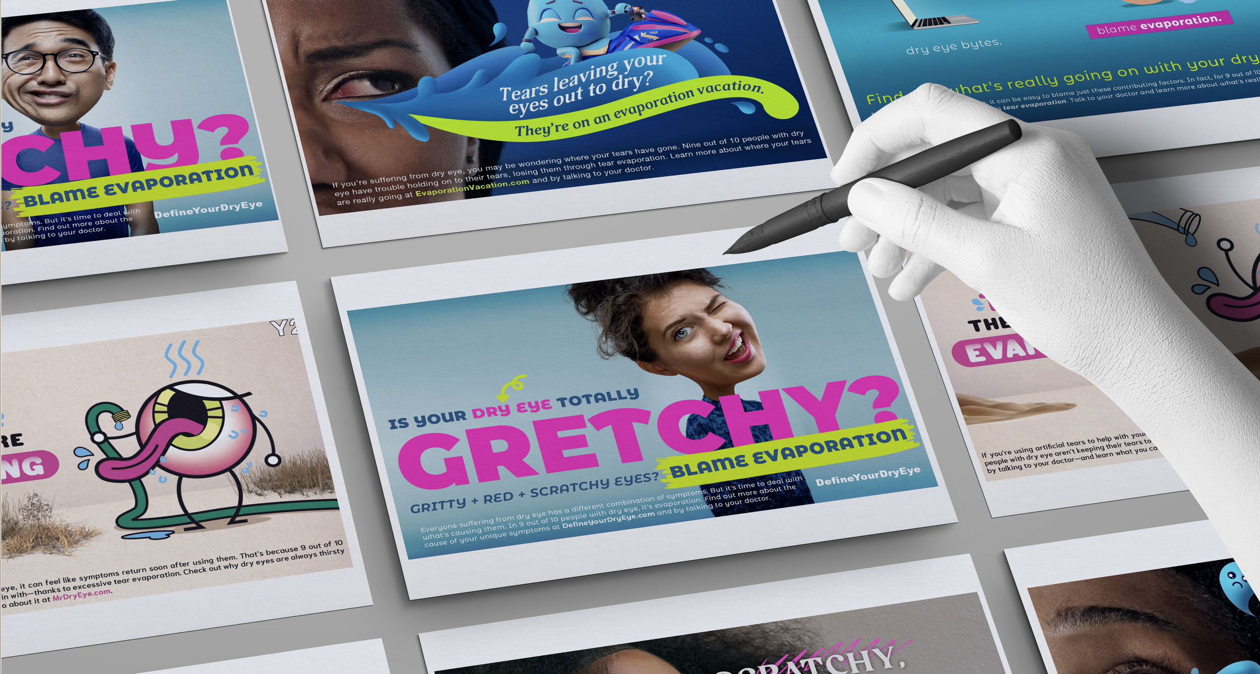
How We Made Dry Eye Loud
*
How We Made Dry Eye Loud *
We hit every platform with specificity and spark:
Times Square billboard takeovers brought eye irritation to the heart of NYC
DryEyeProblems.com reimagined the condition with approachable UX and emoji-level clarity
A social strategy rooted in shareable assets and real-person relatability
Out-of-home placements mimicked beauty ads—then flipped them
Videos personified symptoms, adding absurdist humor to medical discomfort
From print to pixel to OOH, the entire experience was unified by a single directive: Make it easy to understand, impossible to ignore.
Impact, Not Just Impressions
*
Impact, Not Just Impressions *
Recognition:
🏆 Telly Silver (2024) – Branded Content – Pharma
🏆 DTC National Awards (2024) – Bronze – Best Disease Education/Social
🏆 WebAwards – Pharma Standard of Excellence
Site Engagement 500K+ users across owned & organic channels
“Dry Eye Problems turns frustration into understanding and gets it exactly right.”
– Fierce Pharma

From Concept to Craft
Making the Invisible Impossible to Ignore
This campaign made evaporative dry eye understandable, relatable, and... visible. That’s the magic of design when it meets empathy and a little chaos.